The Future's Bright! | AW19 Colour Trends
LONDON FASHION WEEK | SHOW REVIEWS
Discover the colours set to dominate AW19, straight from the catwalks of Markus Lupfer, Atelier Zuhra and A-Jane
One of the great aspects of seeing the live shows at fashion week is gaining an insight into the new trends coming through, the current ones set to prevail and those that will be forgotten within a season. While my personal style is not driven by trends, my job demands that, at the very least, I’m aware of them, if not blogging about them and incorporating them into my styling work. Being ‘in the FROW’ helps me stay ahead and shop with a bit more savvy! And by following my blog, you can do that too!
So with that in mind, here’s my lowdown of the colour trends that made a splash at the Autumn/Winter ‘19 shows. Hint: primary colours feature everywhere!
Markus Lupfer | AW19
A decidedly grown up collection, with a nod to the designer’s wit in the form of outsized, furry mittens holdalls and trapper hats. Gone were the graphics, in were neon, leopard print and columns of mono-colour.
Paired-down sophistication as the label celebrates its 20-year anniversary.
Leo Meets Neo-n!
Much to even the many a fashion editor’s surprise, neon is a trend that just won’t quit! Despite its brightness, I doubt anyone saw it coming! LFW street style was awash with light, as neon hues of pink, yellow, green and orange stalked the pavements. Add to that the second most ubiquitous trend of this season - leopard print - and you’ve got yourself a double-whammy, as seen above at Markus Lupfer! Could this mean we actually don’t have to shop at all come autumn?!
R E D
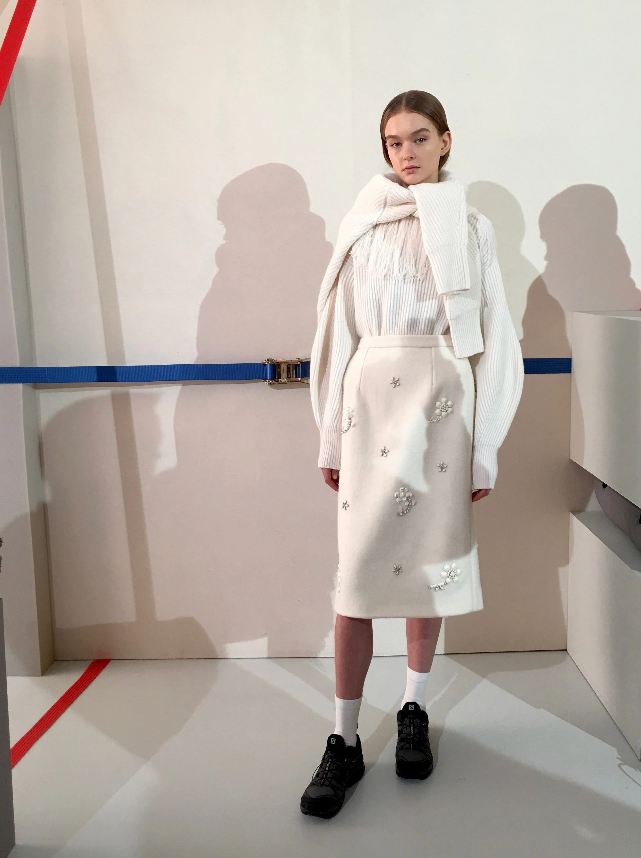
On the flip side were these mono-colour looks of top-to-toe red, white and navy blue. Super-sophisticated, highly wearable and WARM for winter! Could fashion itself be growing up?
Cool-Toned Winter Warmers!
Let’s not get ahead of ourselves! Here, pretty turquoise florals were layered under chunky, oversized knits in shades of fuchsia and navy. Hats, hoods, scarves and gloves were BIG! I seriously doubt these mittens are tech-enabled for touchscreens! But the effect was sensible, somehow; stylish, certainly; as one imagines the après ski crowd lounging in enormous trapper hats and mittens, nursing a schnapps or two.
atelier zuhra | AW19
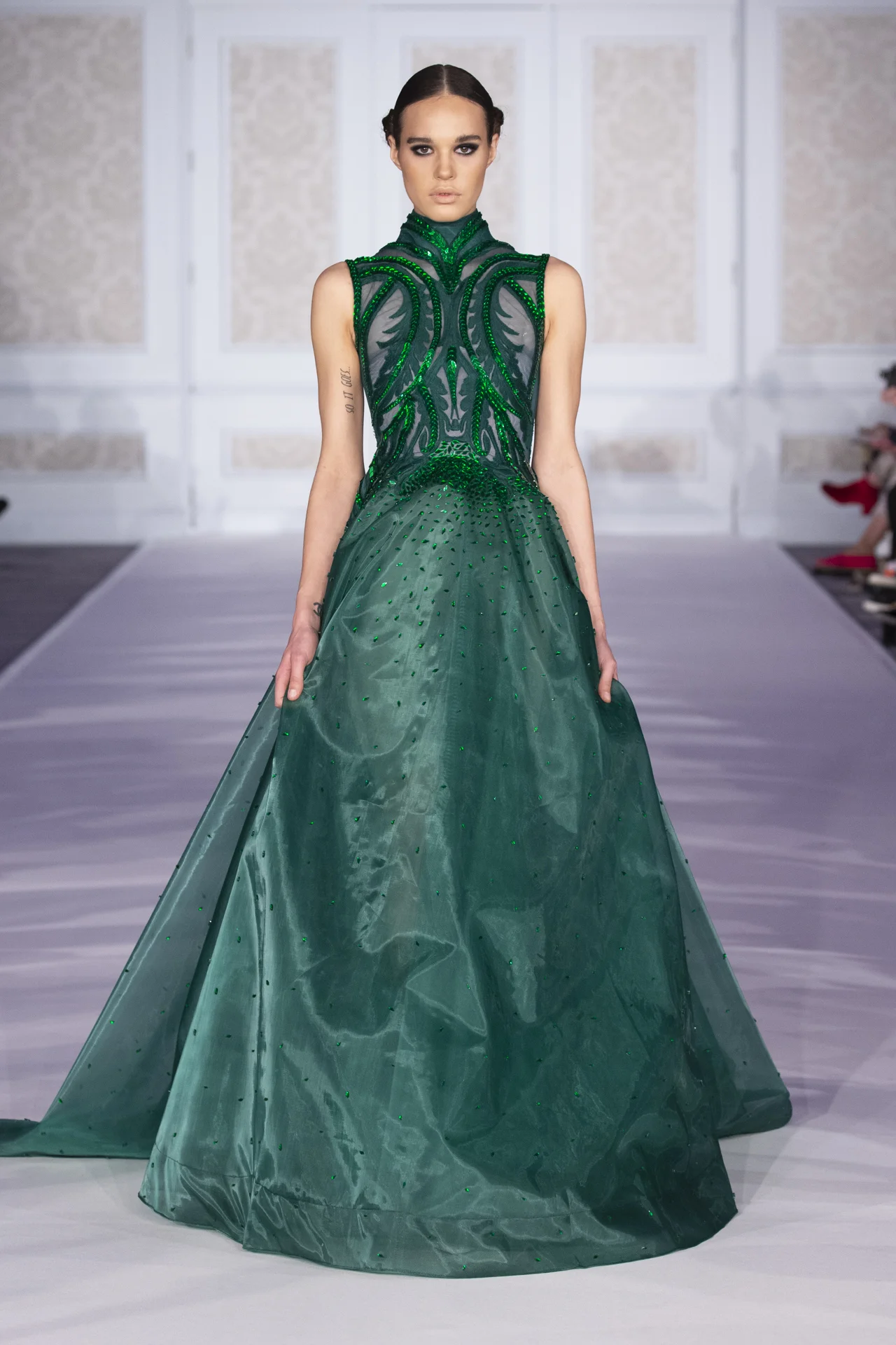
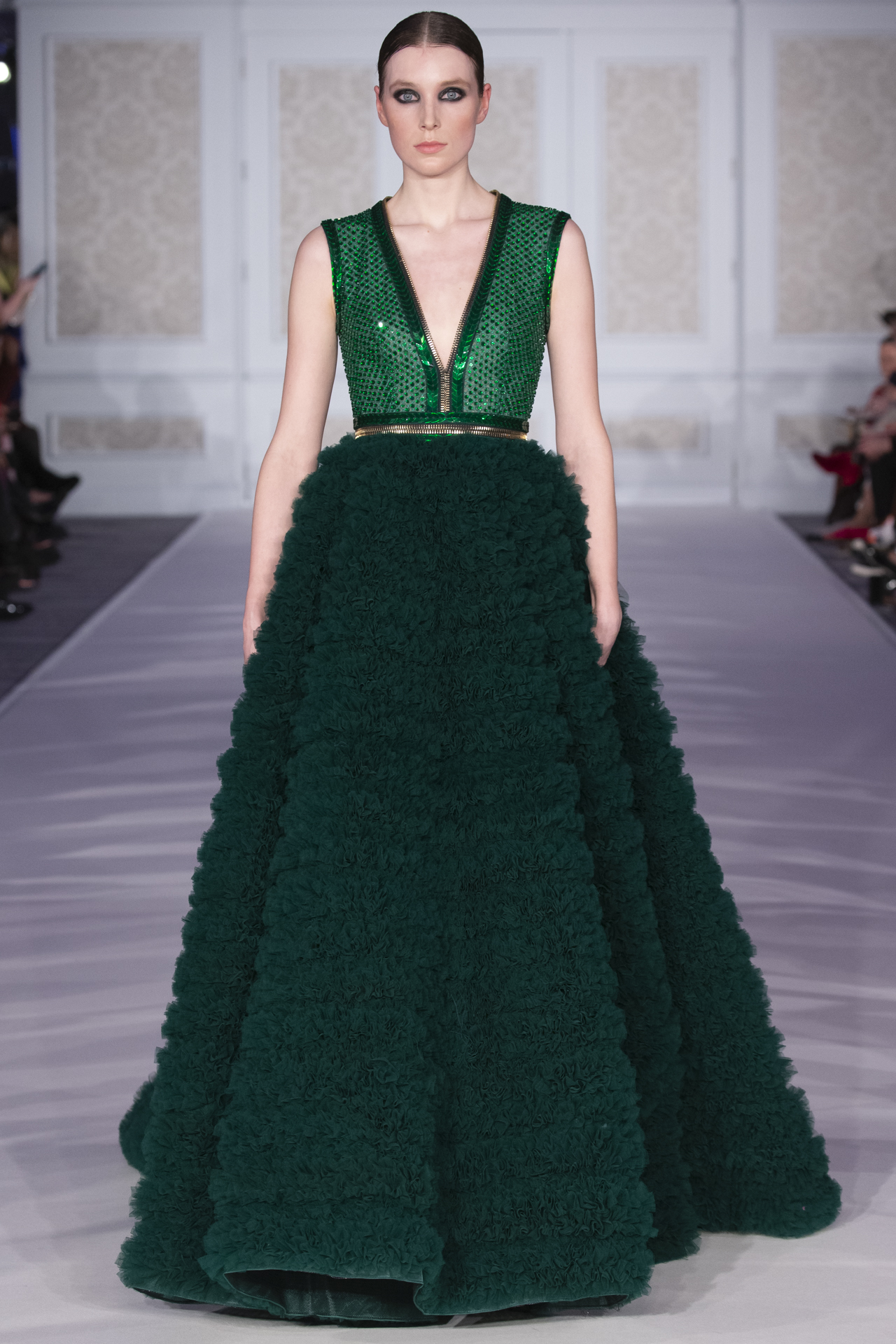
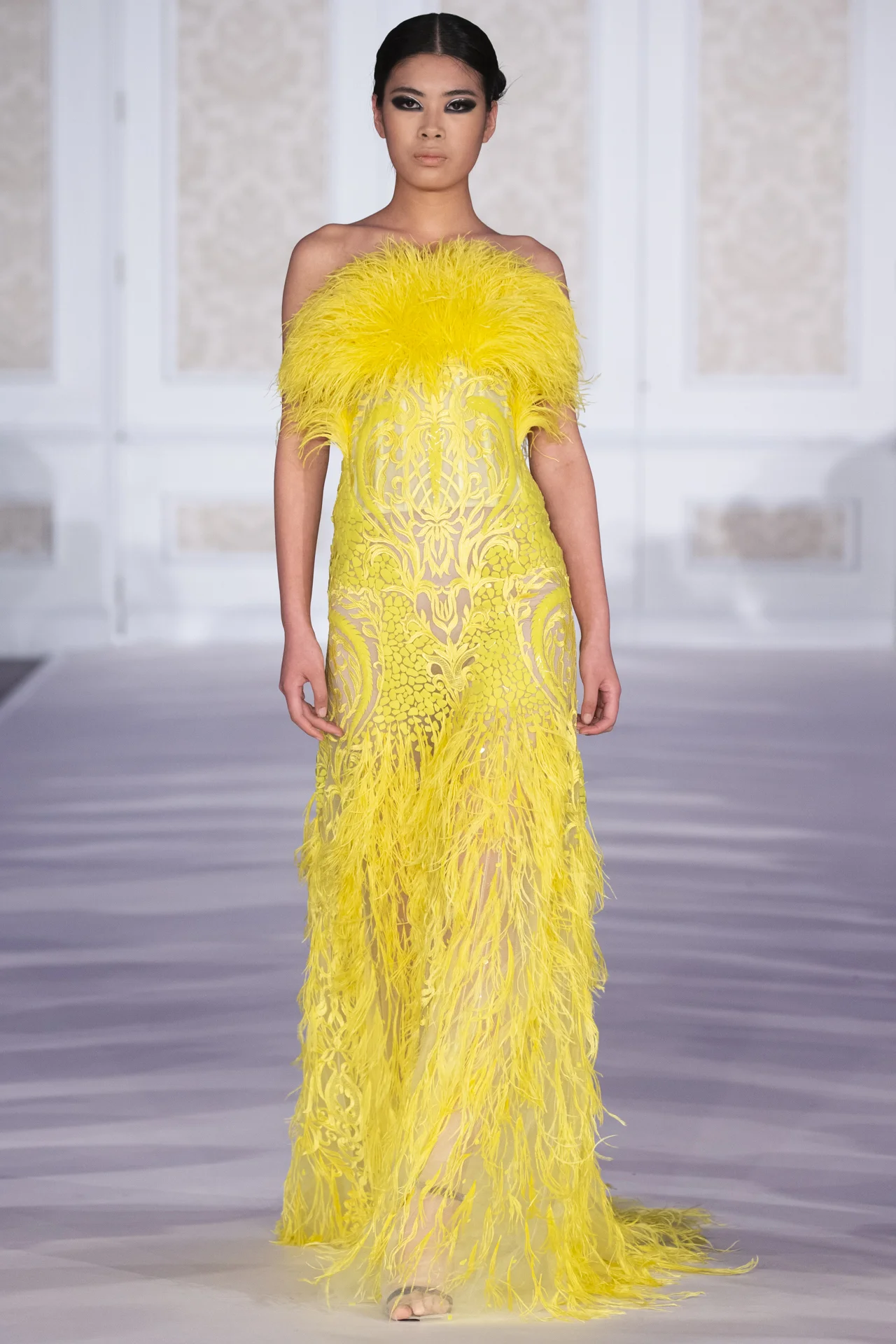
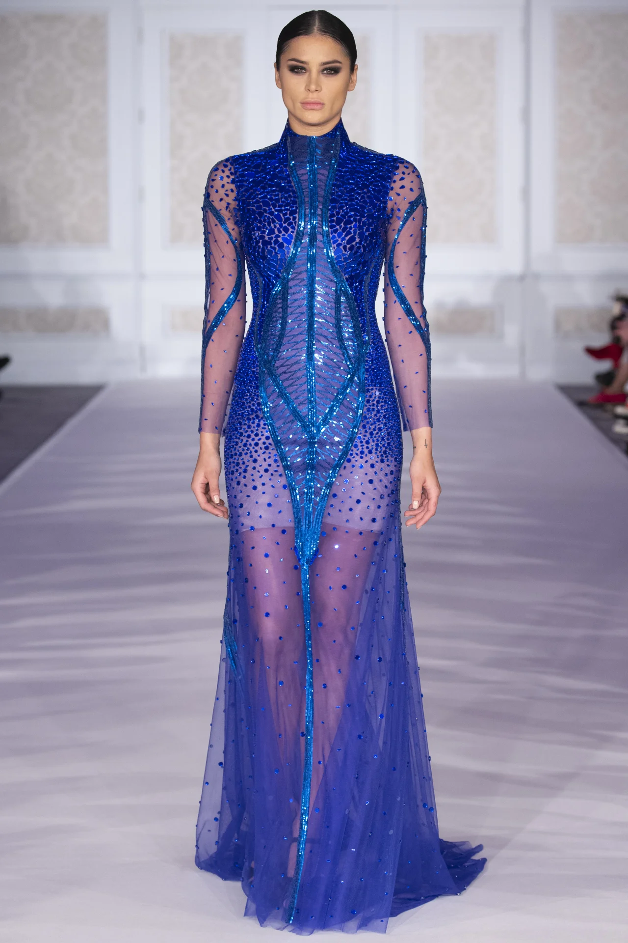
A treasure-trove of jewel-tones in feathers, silk, satin and tulle.
These gowns are the stuff of dreams. Vivid, technicolour dreams, that is. Every stone, from emerald to amethyst, ruby to sapphire and yellow diamond, were represented in these fantasy fashion frocks.
One model, one dress. The extravagance was real, and the setting, The Connaught Rooms, suitably opulent.
Photos: Simon Armstrong
The Connaught Rooms
Jewel Tones | These Glorious Gowns Need No Further Explanation…
Experience The Final Walk
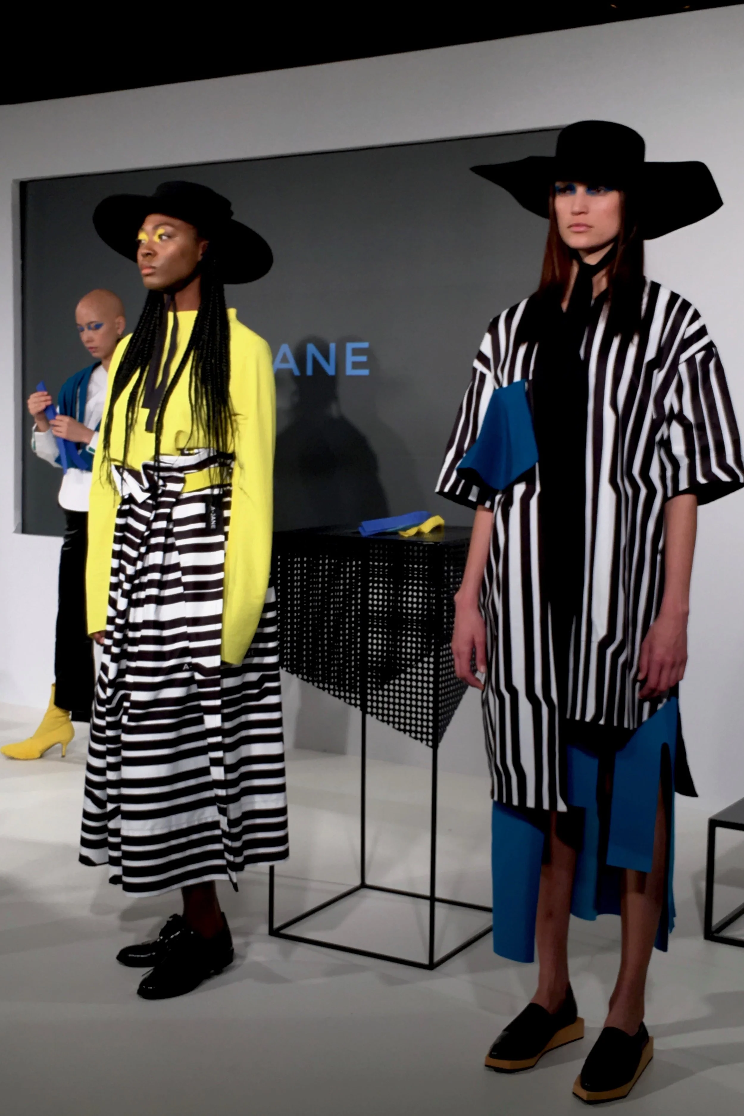
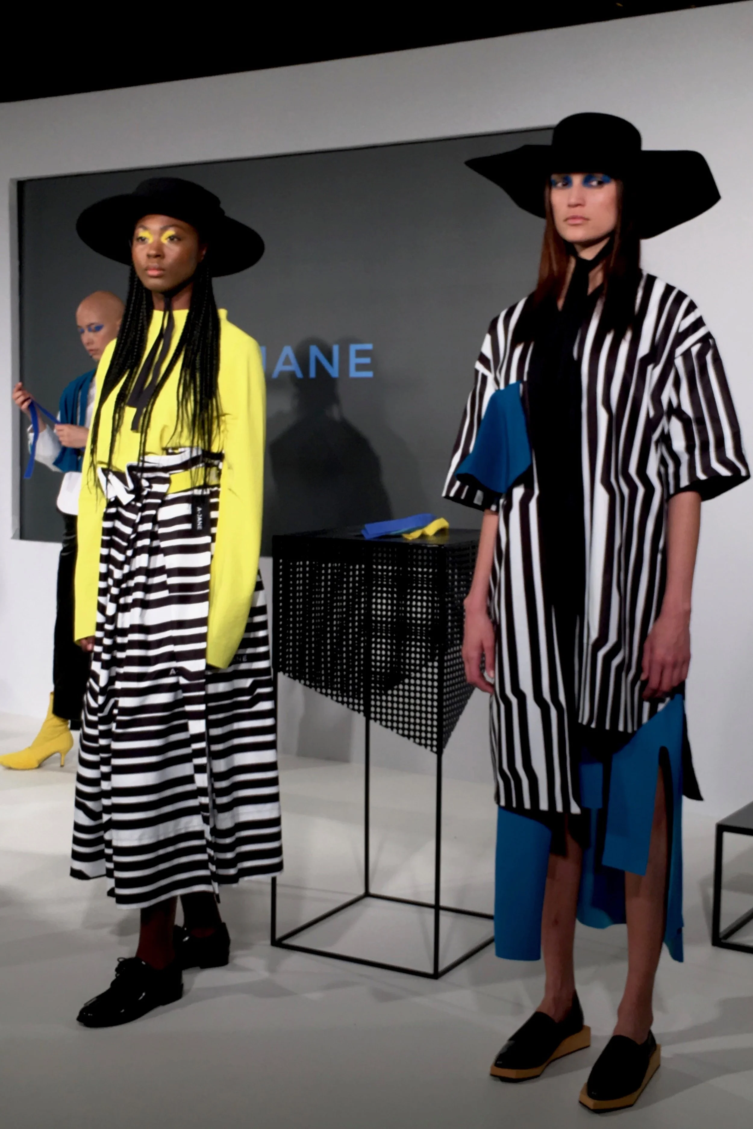
A-jane | aw19
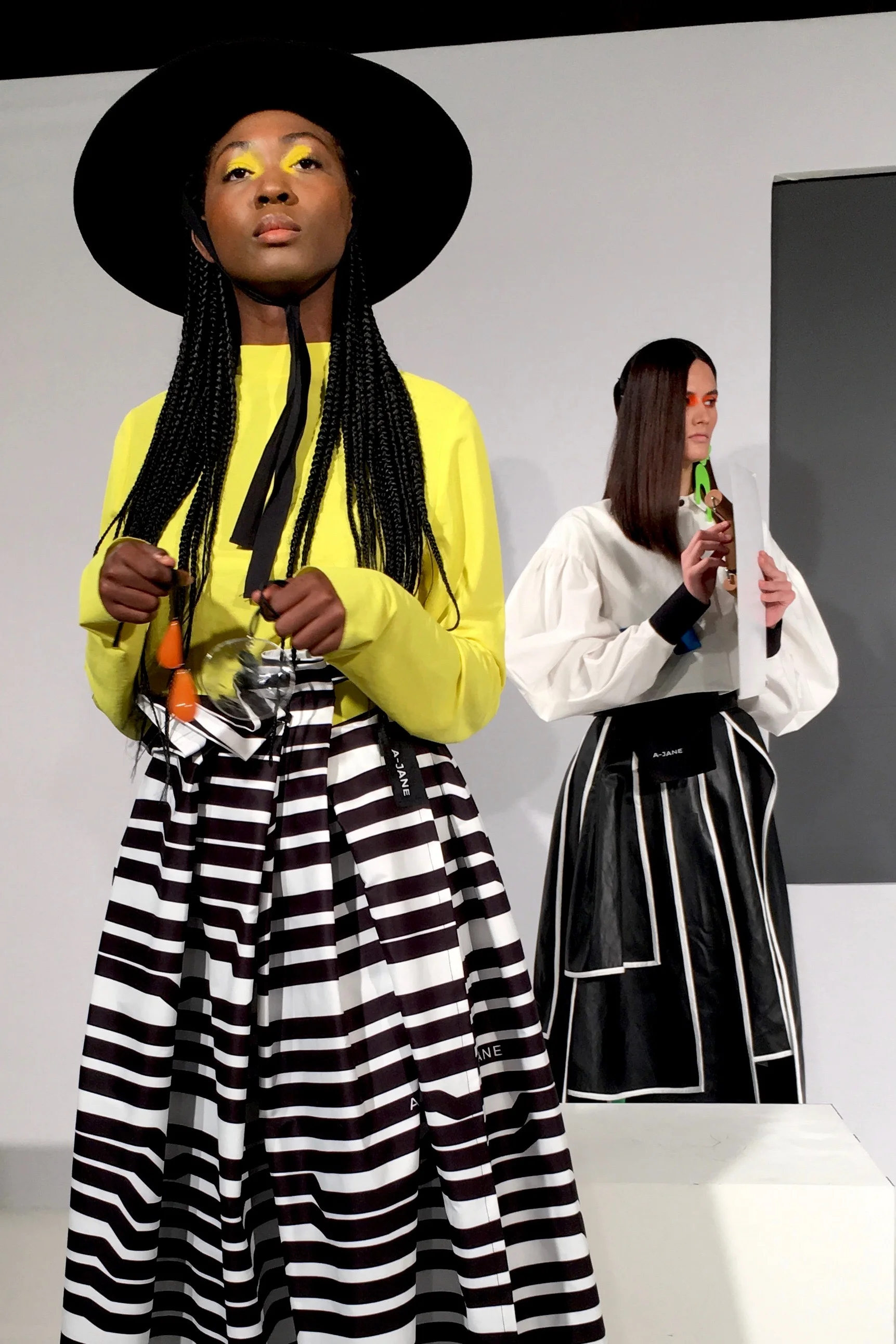
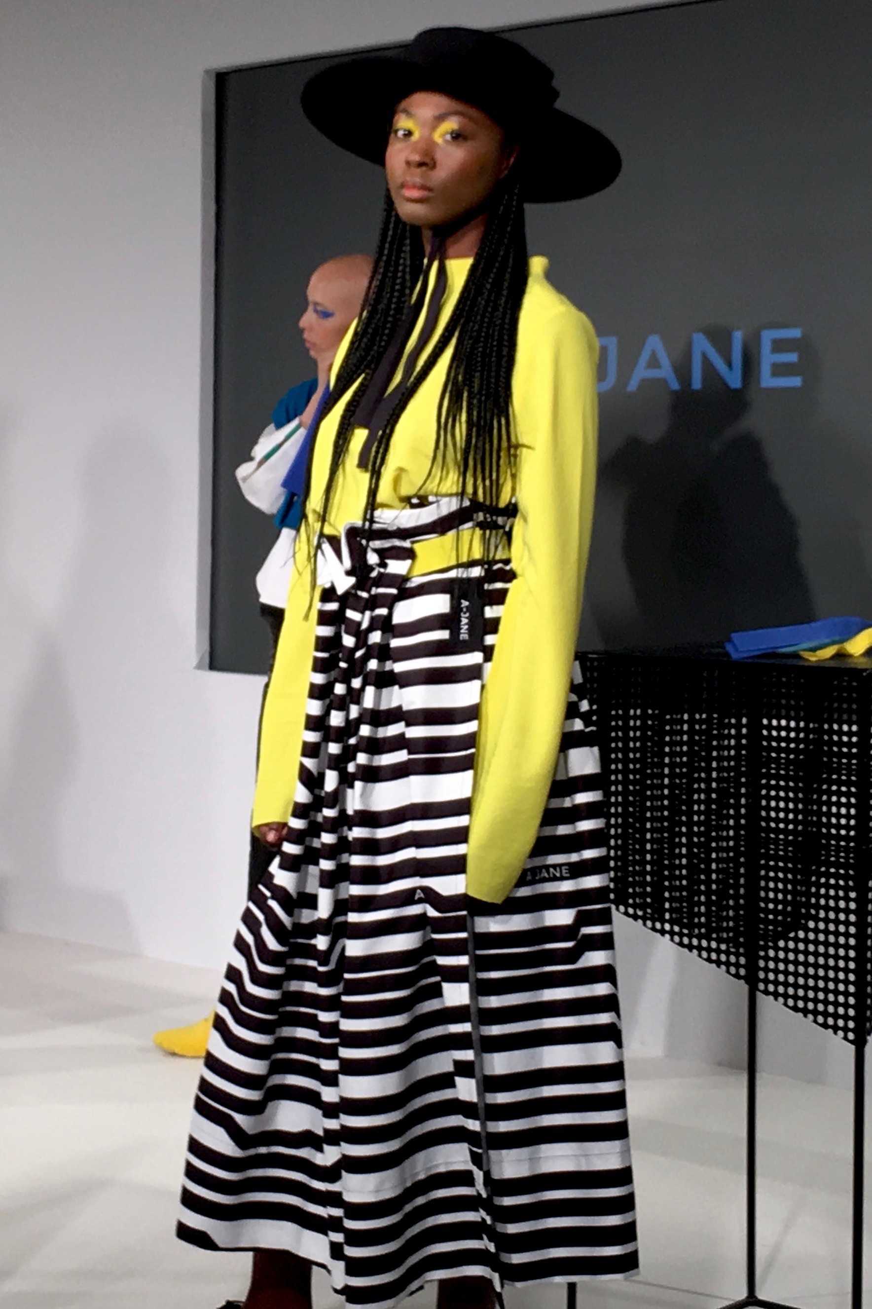
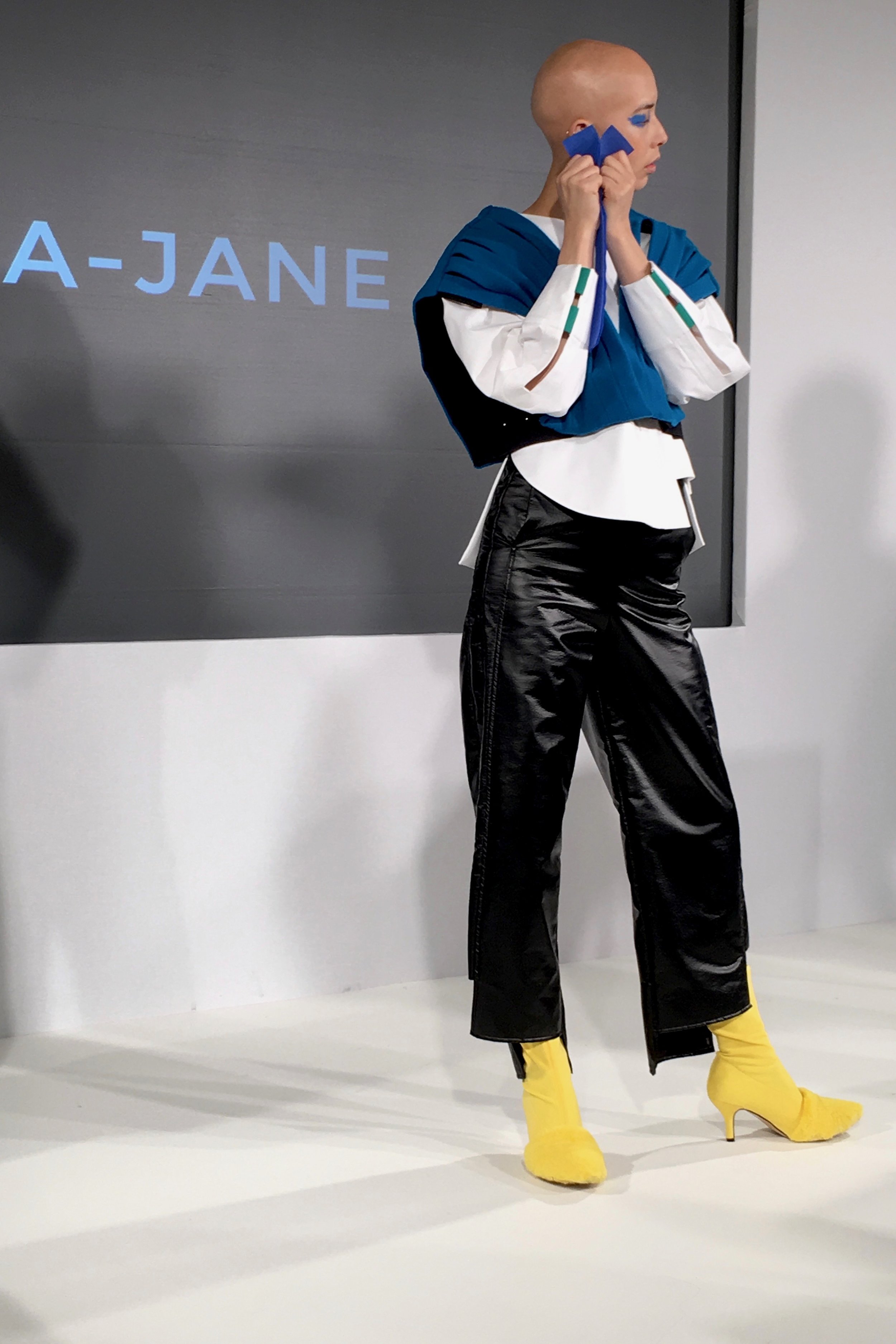
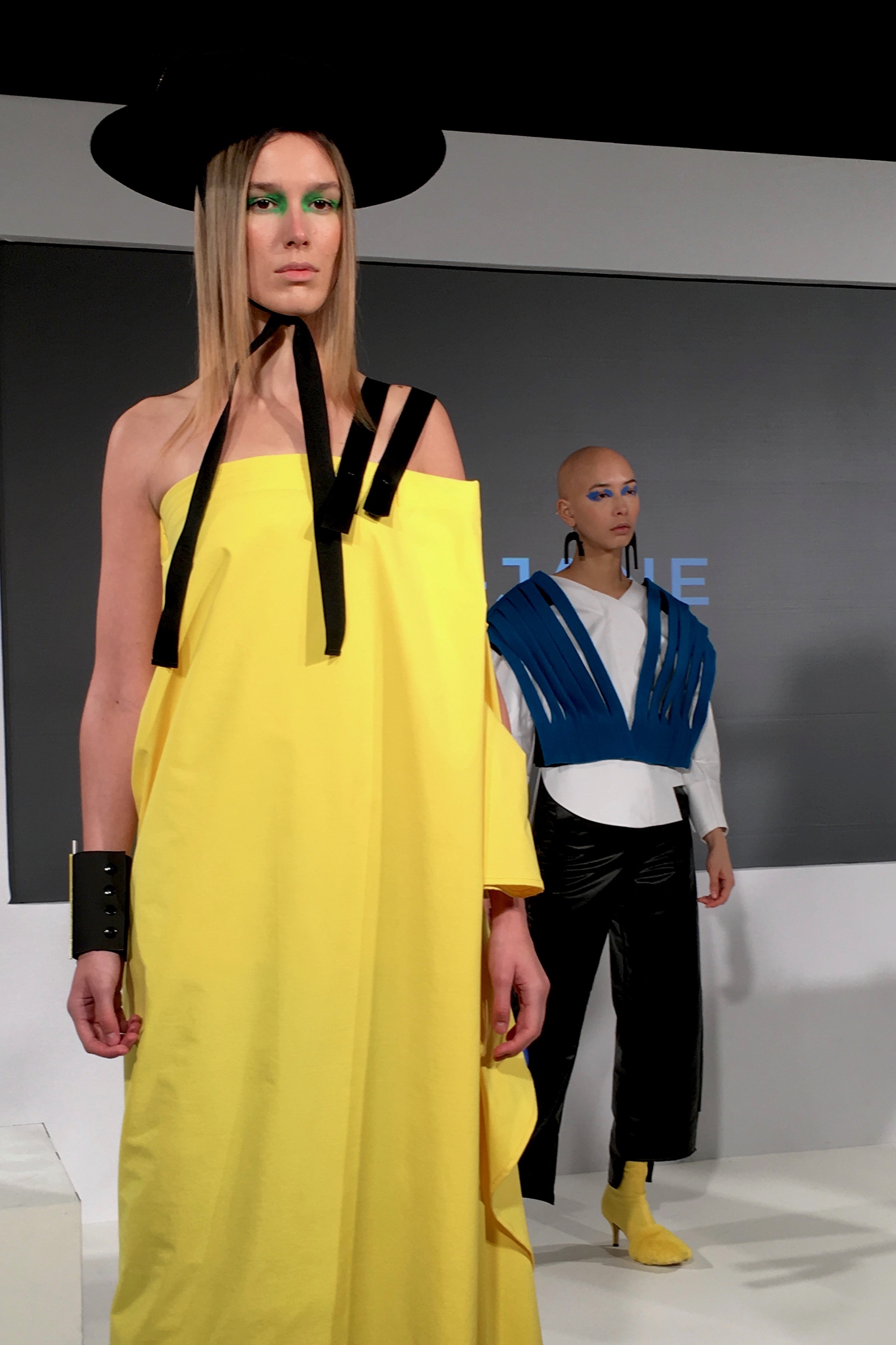
Monochrome madness with more than a pop of primary colour!
This was a sensory experience in more ways than one. While you can clearly see it was a visually striking collection, what you can’t experience, unfortunately, is the unusual aural delights to which we were witness.
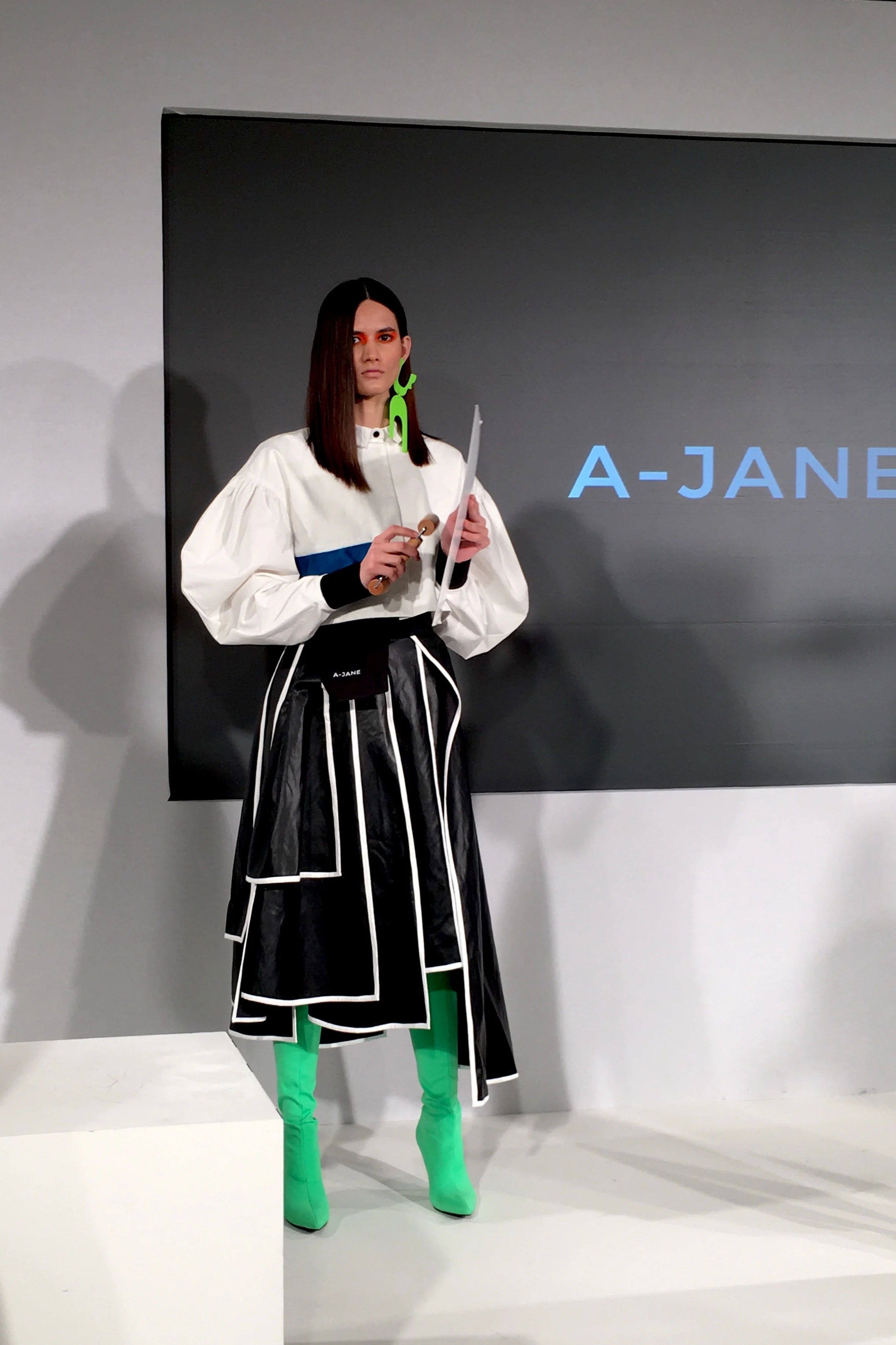
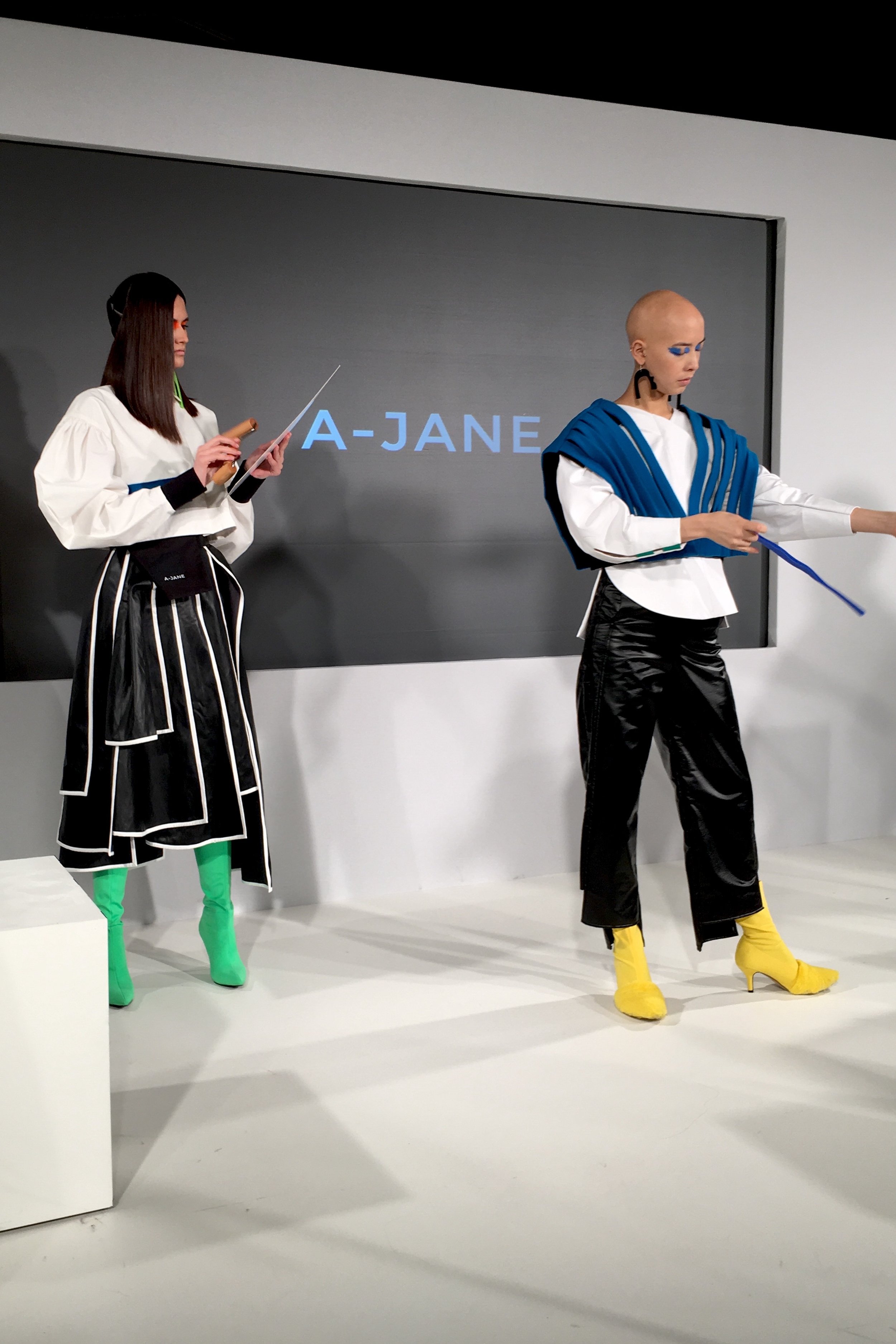
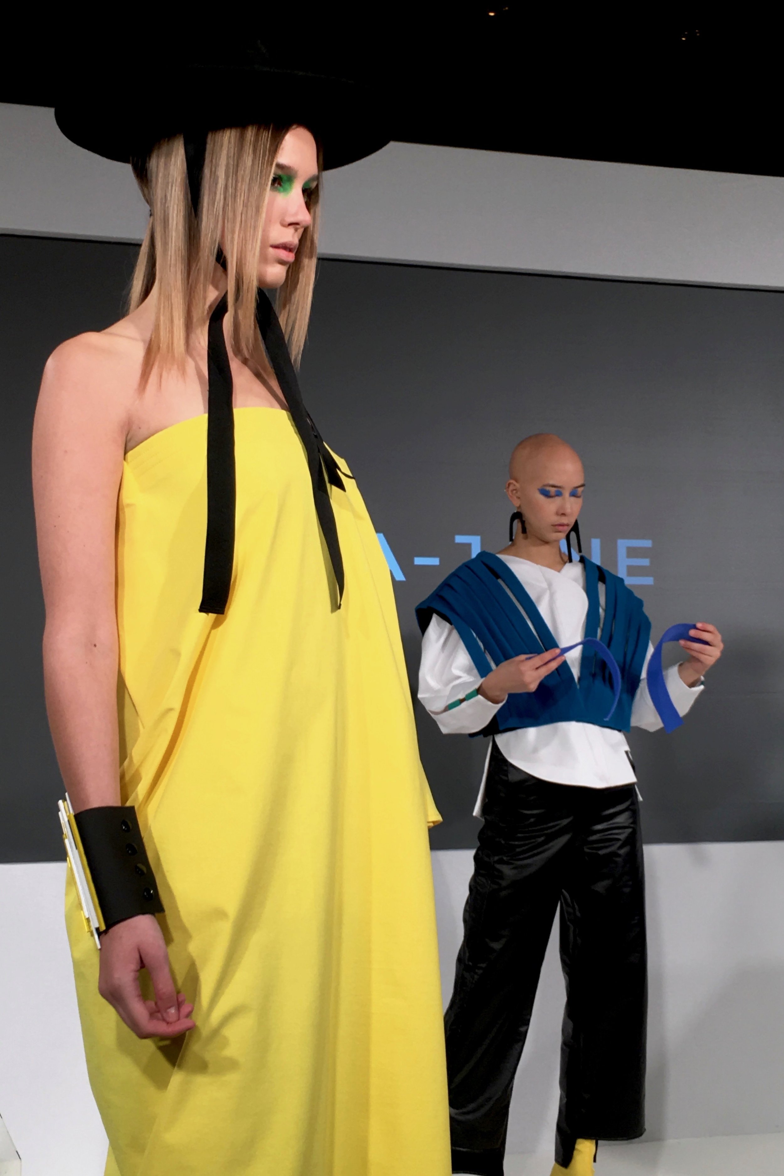
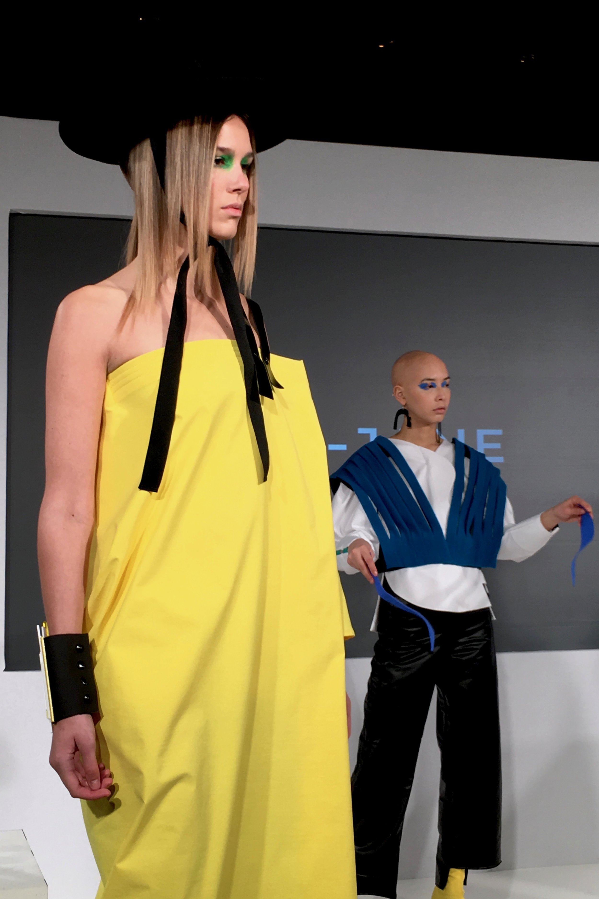
Models intermittently pulled velcro pieces apart, chimed, scratched and ripped their way through the presentation using mic-ed up boards, tape and rudimentary instruments, which made for a quirky accompaniment to the bold, modern aesthetic.
Monochrome Magic with a Primary Pop
Not-So-Mellow Yellow
Yellow was a key accent, indeed the dominant accent, that brightened a predominantly black and white collection. Blue and green, in pure hues were used, more sparingly, to punctuate and highlight on earrings, boots, belts and makeup. There was no red to be seen, but the use of these two primaries and one secondary colour made for a paired-down palette that allowed the shapes to cut through in bold, angular fashion. A Crayola-lover’s delight!
Primary [and secondary] Colours
Aural Stimulation
Models tore strips of velcro apart, ripped lengths of tape and chimed beads together in a reflection of the designer’s inspiration, Neue Music. One of the concepts behind which is Atonality - music that doesn’t follow a key - and freedom of expression. This carried through to the way Alice Jane began the design process - without the boundaries of line, paper and preconception.
~ Style Tip ~
For me, the quickest, easiest, and often cheapest way to look ‘on trend’ is to know the key colours of the season. For example, if red is making a comeback (as we can see above), and you have a much loved, but long-forgotten red coat at the back of your wardrobe, have it freshly dry-cleaned and pair with your latest purchase or favourite jeans to give it a new lease of life and instantly update your look!
Or if you’re out shopping, and a rich, regal, red handbag just happens to be on sale - snap it up! - come autumn/winter you’ll be bang on trend without paying full price!
Here’s one way I’ll be wearing the new primaries - all together!
How will you wear the predominant primary palette coming through for AW19? Tell me a comment below!
Thanks for reading.
Nx
