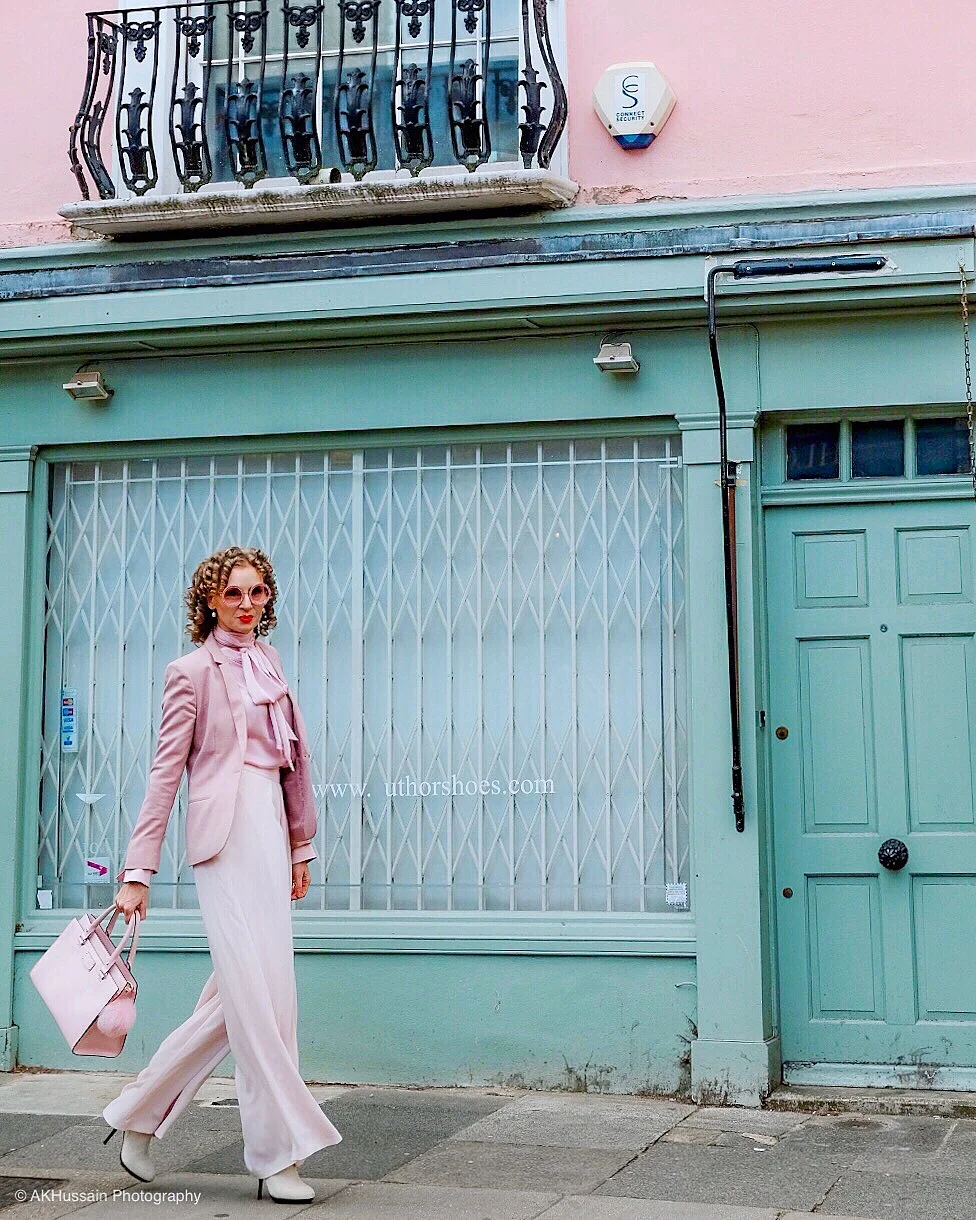
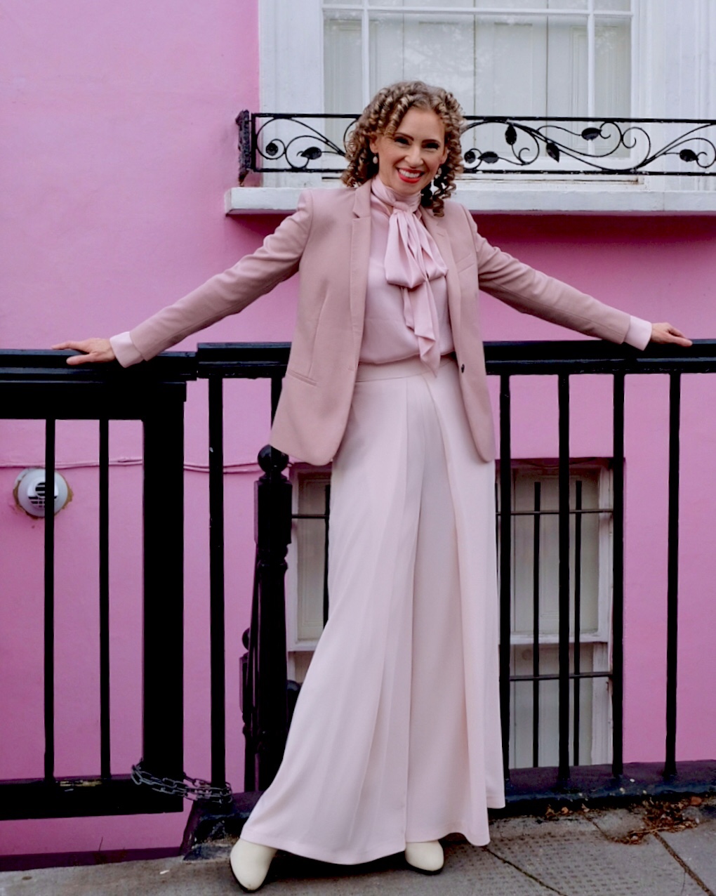
A Notting Hill Colour Love Story

Photo: AK Hussain Photography
Layering blush on blush for a sugary, sherbet colour crush against a palette of pretty pastels!
Shot by AK Hussain Photography and Adventure in Film. Edited by me.
Whether it’s the colourful houses of Notting Hill, or the movie magic that has popularised this place for tourists, film buffs and bloggers alike, there’s an undeniable vibrance to these streets that’s intoxicating. Everywhere you look, there’s something to fire the creative imagination.
Scroll down to see what we discovered… and to shop the look.
Perfect Pastel Pairing

Spreading Autumnal Sparkles


Photo: AK Hussain Photography
~ Style Notes ~
Wearing a ‘column’ of one colour can really lengthen the frame and elongate the body. I love doing this - and it’s important to remember that not every colour has to match exactly. In fact, it’s more interesting if they don’t match! Every piece I’m wearing was purchased at entirely different times. Just be sure that they’re in the same tonal family - ie if there’s a warmth to the colour you’re matching, look for similar warmth in the pieces you put together. Likewise, try to identify if colours are white and ‘milky’, or bright and ‘juicy’. Then try to pair like with like.
Picture Postcards from Portobello Road


Photos: AK Hussain Photography
Blue Period


Photos: Adventure in Film


Photos: AK Hussain Photography
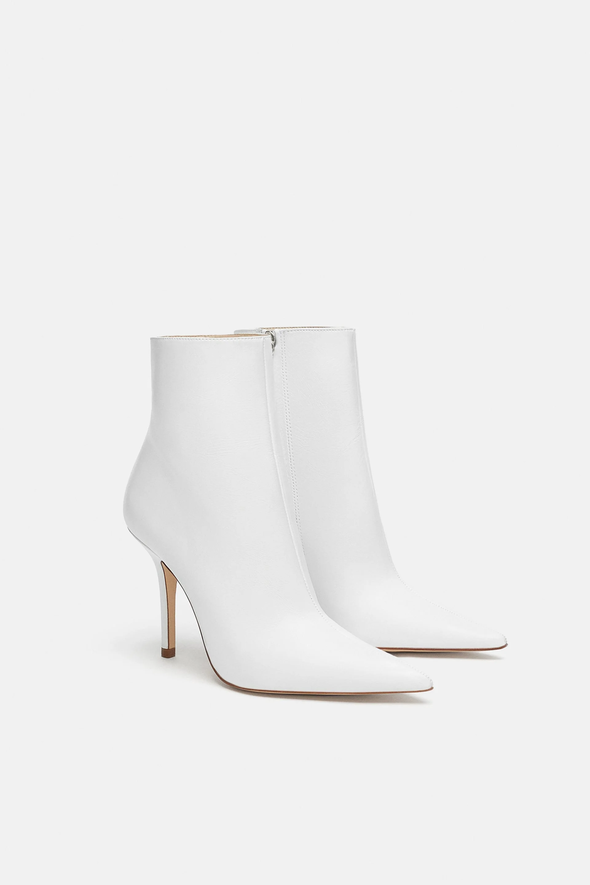
~ Shop the Look ~


Local “Colour”


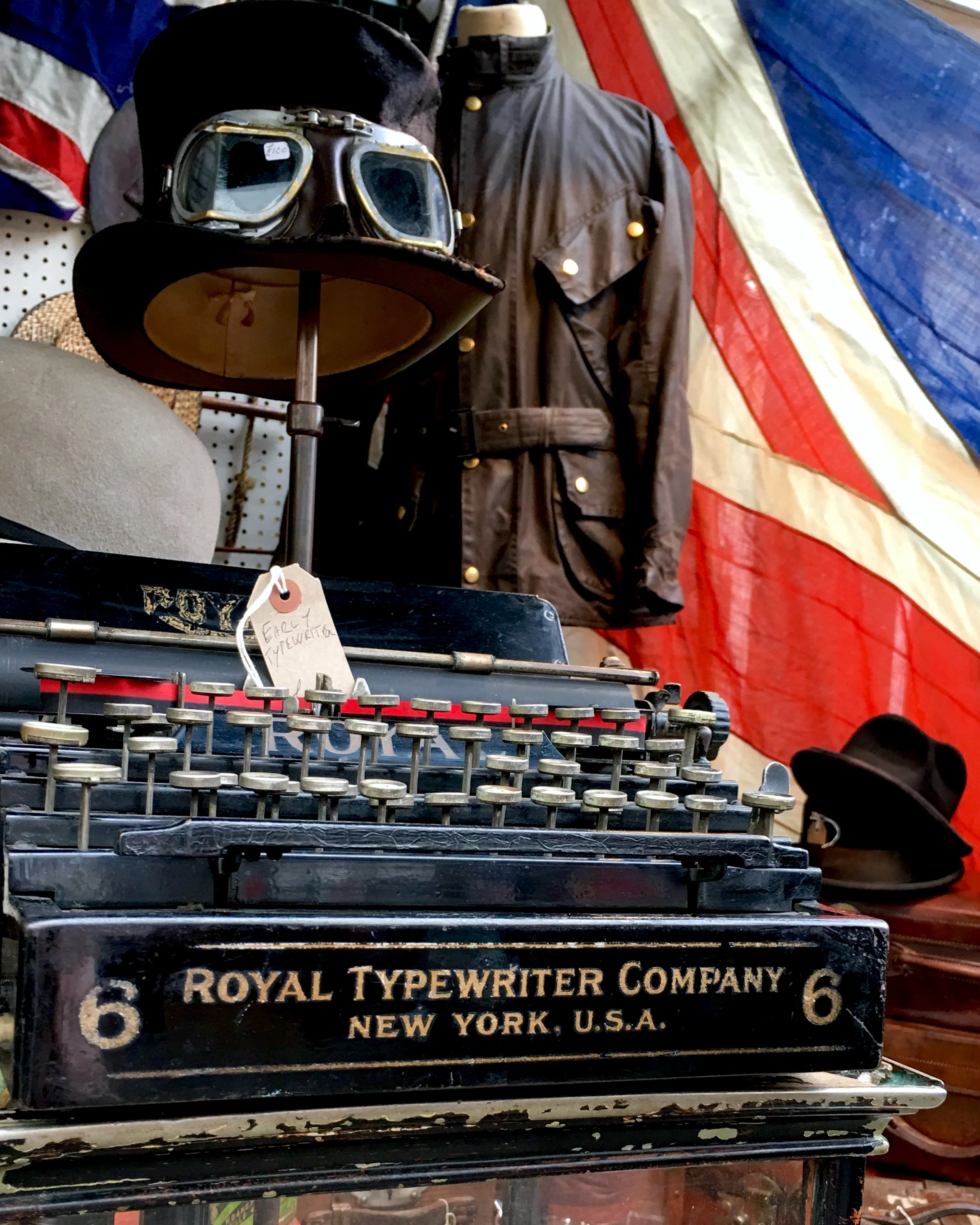
Wandering the streets and independent shops of Notting Hill and Portobello Market, you get the feeling you could literally find anything at all in the world! There is no shortage of ‘Old Curiosity Shops’ to browse and explore. A designer’s dream! Take the day off and explore!
What’s your favourite part of London? Suggest a spot for a future photo shoot, or simply tell me where to find the best coffee! Tell me your London secrets in the comments.
Thanks for reading,
Nx